Commodities Bubble Reax
Wray responds to critics of yesterday’s post, and includes an excerpt from his policy brief on the topic (for a more condensed version, highlights of the brief are here).
Wray responds to critics of yesterday’s post, and includes an excerpt from his policy brief on the topic (for a more condensed version, highlights of the brief are here).
(Cross posted from EconoMonitor)
Back in fall of 2008 I wrote a piece examining what was then the biggest bubble in human history: http://www.levyinstitute.org/pubs/ppb_96.pdf.
Say what? You thought that was tulip bulb mania? Or, maybe the NASDAQ hi-tech hysteria?
No, folks, those were child’s play. From 2004 to 2008 we experienced the biggest commodities bubble the world had ever seen. If you looked to the top 25 traded commodities, you found prices had doubled over the period. For the top 8, the price inflation was much more spectacular. As I wrote:
According to an analysis by market strategist Frank Veneroso, over the course of the 20th century, there were only 13 instances in which the price of a single commodity rose by 500 percent or more. For example, the price of sugar rose 641 percent in 1920, and in the same year, the price of cotton rose 538 percent. In 1947, there was a commodities boom across three commodities: pork bellies (1,053 percent), soybean oil (797 percent), and soybeans (558 percent). During the Hunt brothers episode, in 1980, silver prices were driven up by 3,813 percent. Now, if we look at the current commodities boom, there are already eight commodities whose price rise had reached 500 percent or more by the end of June: heating oil (1,313 percent), nickel (1,273 percent), crude oil (1,205 percent), lead (870 percent), copper (606 percent), zinc (616 percent), tin (510 percent), and wheat (500 percent). Many other agricultural, energy, and metals commodities have also had large price hikes, albeit below that threshold (for the 25 commodities typically included in the indexes, the average price rise since 2003 has been 203 percent). There is no evidence of any other commodities price boom to match the current one in terms of scope.
Now here’s the amazing thing about that bubble. The staff of Senator Joe Lieberman and Representative Bart Stupak wanted to know whether the bubble was just due to “supply and demand”. Relying on the expertise of Frank Veneroso and Mike Masters (two experts on the commodities market), I was able to conclude beyond any doubt that it was a speculative bubble driven by a “buy and hold” strategy adopted by managers of pension funds. Hearings were held in Congress, with guys like Mike Masters testifying as well as representatives from the airlines and other industries.
The pension funds panicked, realizing that their members would hold them responsible for exploding prices of gasoline at the pump. Pension funds withdrew one-third of their funds and oil prices fell from about $150 per barrel to $50. If you want to read the detailed analysis, go to my paper cited above—it has to do with commodities indexes, strategies pushed by your favorite blood sucking vampire squid (Goldman Sachs), and futures contracts. It gets wonky. To make a long story short, the bubble ended in fall of 2008.
But then the crisis wiped out real estate markets and the economy. Managed money needed another bubble. They whipped up irrational fears of hyperinflation that supposedly would be caused by Helicopter Ben’s QE1, QE2, and the newly announced QE3. Better run to good “inflation hedges” like gold and other commodities. That did the trick. The commodities speculative bubble resumed.
And boy, oh boy, what a boom. continue reading…
“There’s a 60 percent probability that most advanced economies will fall into a recession, while authorities are running out of options to provide emergency support.” — Bloomberg News today, describing the views of Nouriel Roubini
This forecast from a sometimes-prescient and widely quoted economist brings to mind a question that many people now find irrelevant.
Which should we policymakers choose, option A or option B? How about doing whatever is necessary to balance the government’s budget? Increasingly, policymakers believe that is their only option. In some countries, these policymakers may be right. For them, options A through Z are to raise taxes or cut spending. This is what happens when (1) tax revenues are weak, (2) money is needed to make payments on government debt, and (3) the country in question does not or cannot print its own currency and cannot make reserves for its own banks.
Here in the United States, point (3) above does not apply. Hence, the federal government can issue any amount of securities, with the Fed purchasing them if necessary, as long as Congress is willing to keep increasing the debt limit. Unfortunately, however, the stimulus package of 2009 is wearing off, and Congress and the President have not acted quickly enough to increase spending or reduce taxes. As a result, combined government employment at the local, state, and federal levels has been falling. Unemployment remains ultra-high. Hence, we look forward with great concern to President Obama’s upcoming address on jobs creation. Many constructive proposals are likely to be on offer.
On the other hand, all three points in the third paragraph of this post seem to apply to most of the countries in the Eurozone. They are in some kind of a trap, perhaps a debt trap. continue reading…

According to wsj.com, the S&P 500 stock price index stood at 1,218.89 at the close of the trading day on Wednesday afternoon, after a month that saw much turmoil in the financial markets. Combining monthly data from the website for Robert Shiller’s book Irrational Exuberance with the average unadjusted closing value for August (closes from Yahoo! Finance), last month’s percentage drop of –10.6 percent was the 26th largest in the 1,687-month period from February 1871 to August 2011. Shiller’s dataset includes some very large drops, including –26.5 percent for November 1929, the worst in the sample.
Some basic theories in finance rest upon the assumption that returns and/or changes in prices can be modeled as random draws from a normal distribution, the familiar bell-shaped curve used by statisticians. The late scientist and mathematician Benoît Mandelbrot showed that many financial data series had so many large increases and decreases that they could not be modeled in this way. (For a posthumous appreciation of Mandelbrot’s work, see science writer James Gleick’s article in the New York Times Magazine.) Mandelbrot hypothesized that many data sets could instead be modeled with the “heavy-tailed” distributions referred to as alpha-stable or stable-Paretian. These distributions allow for many “outliers,” or extreme observations. continue reading…
With all the recent coverage of the federal government’s debt-limit impasse, it has been some time since the private sector’s financial picture has received much attention in the popular press. Nonetheless, there seems to be little news, as the most recent flow-of-funds data release from the Fed depicts a continuation of trends that have held for at least the past two years or so. Specifically, for the business sector, the figure below shows declining ratios of debt to GDP and increasing ratios of cash-like assets to GDP. (You may need to click on the image to make it large enough.)
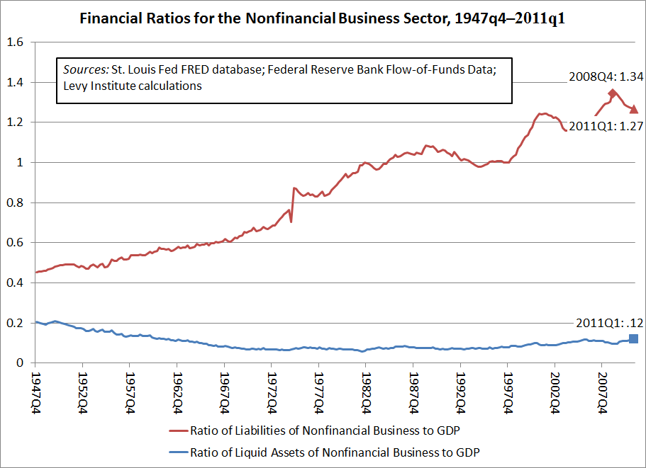
(Liquid assets include checking and savings accounts at banks, Treasury securities, and currency, all of which can be useful in avoiding missed payments, etc., when financial stresses arise. Also, assets and debts are of course measured in terms of dollars, rather than numbers of bonds, shares, etc. In all of the financial ratios discussed in this post, GDP is expressed in terms of seasonally adjusted output per year, though the data are for individual quarters.)
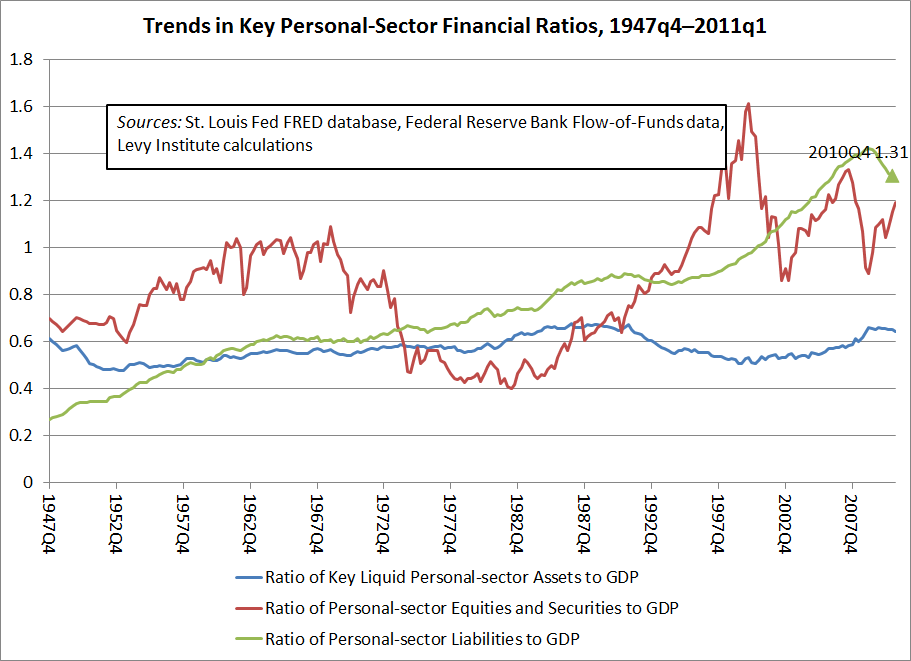
In the next figure, shown below, we can see that the personal sector (households, small businesses, and nonprofit organizations) has experienced increasing ratios of securities holdings to GDP in recent quarters, along with falling ratios of liquid assets to GDP. Moreover, as a percentage of GDP, the liabilities of this sector, too, have been falling.
The falling private-sector debt-to-GDP ratios are not surprising in light of the recent financial crisis and the collapse of the real estate market, which not surprisingly led to a retrenchment in many forms of lending, as well as many defaults. Some will find it remarkable that private-sector debt has fallen so rapidly, but for a number of reasons, financial crises are typically followed by at least a partial turn toward financial conservatism and reregulation. Also, the weak economy has naturally curtailed the kinds of spending that are often fueled by new borrowing. On the other hand, the nearly relentless upward trends shown throughout both figures put more recent declines in private-sector debt into perspective. These long-run trends reflect what can be thought of loosely as a gradual increase in U.S. financial fragility beginning in the aftermath of World War II, in the 1940s. Levy Institute scholar Hyman Minsky was noted for observing this trend and warning of the threat it posed.
Update, July 27, 2011: I have made a few changes to this post to improve its clarity. Also, to see all comments on this post, please click on the link below. -G.H.
Many Levy Institute scholars and staff members are in New York City for this year’s conference on the late Institute scholar and author. Breakfast should be ending now, with the conference about to begin. The conference’s theme is “financial reform and the real economy.” More information about the conference, including the program, are available at the conference page on the Institute’s website.
Update, approximately 3 pm, April 13: The first audio from the conference has now been posted to this page on the Institute website. Now available there is audio from the conference’s formal opening and from the first session. You can choose among recordings of Leonardo Burlamaqui, Dimitri B. Papadimitriou, Jan Kregel, L. Randall Wray, and Eric Tymoigne. The conference ends this Friday, April 15.
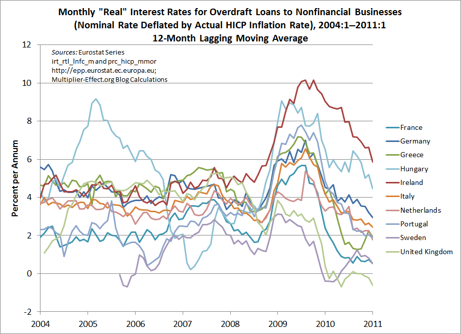
Readers may have seen two charts that are part of a column by David Wessel published last week. For five European countries, they compare actual interest rates with those prescribed by a standard policy rule. Wessel’s charts provide some interesting evidence that European Central Bank monetary policy has been either too loose or too tight most of the time for several currently ailing European economies, given these countries’ inflation rates and gaps between actual and potential output. Wessel’s charts support the article’s theme, which is that severe economic problems in some Eurozone countries result in part from the “one-size-fits-all” interest rate policies of the ECB.
Along the same lines, at the top of this entry is a chart of short-term “real interest rates” faced by business borrowers who use overdraft loans in a group of European countries, which are mostly members of the euro area. I have used data on interest rates for this common type of loan, adjusting each month’s observation to reflect the same month’s measured consumer price inflation, so that the resulting “real rates” take into account inflation’s effects on the burden of loan payments. Inflation is helpful to debtors because it has the effect of reducing the amount of goods and services represented by each dollar owed under the terms of a loan. Of course, I have used only one of many possible methods that one could employ to approximate real interest rates. Moreover, to construct a true real interest rate data series, one would need to know borrowers’ forecasts of the inflation rate, which is an impossible requirement in most circumstances. Hence, these series and others like them usually need to be taken with a grain of salt.
As theory would have it, real interest rates in different countries tend over the long run to converge on a common value, a result known as “real interest rate parity.” This convergence is assured only under certain exacting conditions that are clearly not met in the case of the numbers depicted in the chart. Nonetheless, the degree to which the rates differ may provide another indication of the disparities in credit costs that are imposed by a unified central banking system. Moreover, the chart shows that some of the countries now experiencing fiscal crises have been suffering the effects of particularly tight credit conditions. For example, Greece’s real interest rate was 20.49 percent in January, as indicated next to the green line representing the Greek data. Real rates for Ireland and Portugal, two other countries whose governments’ financial problems have recently been in the news, are also shown in the figure.
My next chart shows lines for all of the aforementioned countries, plus 7 others, containing points that are constructed by averaging the last 12 months’ observations from the first chart. This removes most of the effects of regular seasonal patterns and helps to highlight longer-run trends, which would otherwise be obscured by the extreme volatility of these series. As a result, we are able to include data for 10 European nations in this figure.
The data underlying the figures are harmonized European statistics, which are meant to be somewhat comparable across national boundaries. Nevertheless, the ten series in the figure seem to show no signs of converging, though their movements appear to be highly correlated over the past three years. According to the averaged data, Irish real interest rates have been the highest among the 10 European economies represented in the graph since approximately spring 2009. In January, the unaveraged real rate in Ireland exceeded 9 percent.
Like Wessel’s diagrams, the ones above show that despite centralized interest-rate setting, one measure of the tightness of policy for actual retail borrowers varies greatly across eurozone economies.
Notes:
The Economic Policy Institute has produced an interesting analysis on jobs lost and recovered in U.S. post-war recessions.
They show how many months were needed, since the beginning of a recession, to get back to the initial employment level. However, the working population is growing over time, so getting back to the employment level of, say, 12 months ago, would not be sufficient to restore the same employment and unemployment rates.

In our chart we assume that population grows at its annual average (around 1.4 percent), and calculate how long it took for employment to get “back on track”, i.e. we compare actual employment with what employment should have been, if jobs grew along with active population. With our modified chart, employment got back on track within three years only in the recession which started in 1969. In all other cases, employment was still below its pre-recession path after three years.
In the current (last?) recession, employment still has a long way to go before we can talk of a “recovery.”
At the last meeting of the American Economic Association in Denver, Giuseppe Fontana discussed the theoretical arguments on whether the Great Recession will generate a permanent loss in output. He argued that, according to the dominant “New Consensus” theory, output should return to its historical path once the shock has been absorbed. Alternative, heterodox theories, suggest that the shock will have permanent effects.

In the chart we plot U.S. real GDP along with its trend, estimated using a simple exponential function over the pre-recession period (from 1970 to 2007). The average growth rate in output over this period was slightly above 3 percent. The dotted red line plots the evolution of GDP, should it resume its average, pre-recession, growth rate. The red line therefore represents the idea that the recession will have permanent effects. The green dashed line has been drawn under the assumption that the economy gets back to its pre-recession growth path by the end of 2015.
Real GDP needs to grow at 5.2 percent from now to 2015, to achieve this result…

With the recent announcement of QE2 (quantitative easing 2), the Federal Reserve’s new round of long-maturity asset purchases, it is worth looking at some of the effects of QE1. In November 2008, the Fed announced large-scale purchases of mortgage-backed securities and debt issued by the GSEs. Its securities holdings began to climb sharply in early 2009. As shown in blue, the monetary base (a broad measure of the Fed’s liabilities) had already begun to rise several months earlier. New asset purchases for QE1 ended earlier this year.
The effects of QE1 and the other stimulative policies adopted by the Fed since late 2008 will be debated for some time to come. But notably, the green line shows that a trade-weighted index of the dollar’s value against a basket of foreign currencies has declined quite a bit. Some world leaders are unhappy about this development, but it may have helped to spur real (inflation-adjusted) U.S. exports, shown in red.
The orange line shows the yield on a 10-year inflation-indexed Treasury security, which can be used as a measure of the real interest rate. This rate has tumbled from well over 3.5 percent to negative levels. Some economists doubt that a monetary authority such as the Fed can succeed in reducing real long-term interest rates over a prolonged period, but this is a remarkably sustained trend.
Notes: The interest rate series in the graph has been rescaled (actually, multiplied by 100), so that its movements can be seen more easily. The export series has been deflated to 2005 dollars, using a chain-weighted GDP price index. The exchange-rate series, which is the Fed’s index of the value of the dollar against the “major currencies,” is scaled so that the first observation equals 1000. The monetary base is expressed in billions of dollars. Except for the exchange rate and interest rate series, all data shown in the figure have been seasonally adjusted. Detailed information on the Fed’s asset purchases and its balance sheet can be found in this series of official reports.


 ShareThis